A mobile application that helps users use BART (Bay Area Rapid Transport), a transit system that serves the San Francisco Bay Area.
BART Application Redesign
Revamping the BART Mobile Experience
Coursework, 2022
Role
- Product Designer
Duration
- 4 Weeks
Tool
- Figma
Finding the Issues
Pain Points — Findings & Insights
To identify potential pain points, I reviewed the current application and focused on content, organizational, usability, technical, and visual design issues. Here are the findings and insights.

Content Issues
The application includes a lot of repetitive and unnecessary content.
Remove repetitive and unnecessary content such as the large map, BART icons, and other transportation methods that serve no value to the user.
Visual Design Issues
Contrast and legibility problems, excessive use of colors, and an outdated appearance.
Design the application with high contrast for readability, a limited color palette for clear differentiation, and a contemporary style to enhance credibility.
Usability Issues
Red bell and warning light triangles icons may create an intimidating feeling.
Remove the red bell and warning light triangle icons to make users feel at ease.
Market Insights
Competitive Analysis — Findings & Insights
To see what other transportation applications do well, I conducted a competitive analysis. Here are the key findings and insights.
Full Competitive Analysis

Google Maps: Allows Users to Plan Their Routes
Incorporate screens that allow users to plan their routes.
Transit: Provides Users with Arrival Times at Stations
Incorporate arrival times at stations.
NJ Transit: Allows Users to Purchase Tickets
Incorporate screens to purchase tickets.
Peer Analysis
Heuristic Evaluation — Findings & Insights
To minimize personal bias in my review, I had Aaron, another design student, conduct a heuristic evaluation of the current application. Here are their findings and my insights.
The language does not reflect the current Apple or Google Maps application.
Develop text content that reflects the current Apple or Google Maps application.
Unclear what color coding means throughout the application.
Have a limited color palette.
Navigating from certain pages back to the map page can be challenging.
Have clearly marked exits and expected user flows.
Secondary Research
News Articles about BART — Findings & Insight
I read multiple news articles about people’s experiences on BART. Here’s what people had to say and a insight.
“The suit follows two others filed in September and June over an April 22 incident at the Oakland Coliseum station when a group of young people rushed a train, robbing and assaulting several passengers.”
– mercurynews.com
“Hop into BART we see homeless. We see junkies, it’s pretty unsafe pretty much,” said Mutchie.”
– kron4.com
“A BART passenger was attacked and sexually assaulted while riding a train in broad daylight.”
– ktuv.com
Incorporate safety tools to make BART appear that they care about riders’ safety and to make riders' feel safer when taking BART.
New Task Flow
Selecting a Route
In the new task flow, users’ current location is already selected when planning their routes, assuming users know their current location. Additionally, users can easily schedule their departure or arrival times, allowing for more precise planning and ensuring they arrive at their destination on time.
Old
Select Current Location
Select Destination
Select Route
New
Select Destination
Schedule Departure / Arrival
Select Route
Ideation
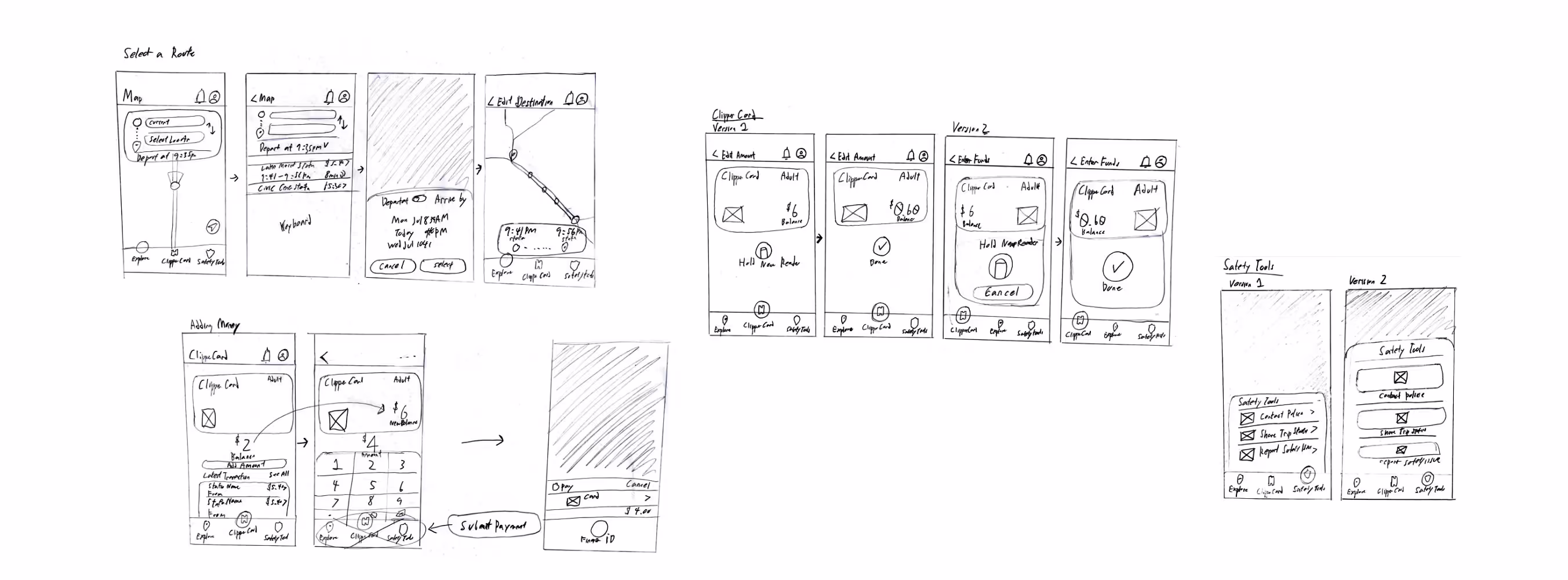
Low Fidelity Sketches
I sketched out potential solutions while considering the insights from my research.
Mid-Fi
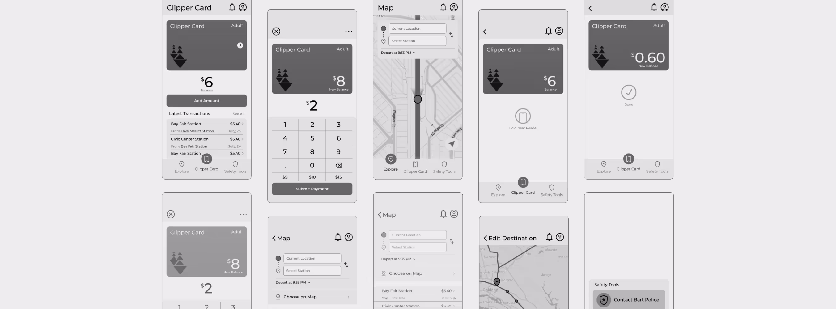
Medium Fidelity Designs & Wireframes
After the sketches, I created mid-fi wireframes to see if they were enough to communicate what the screens do.
Final Designs
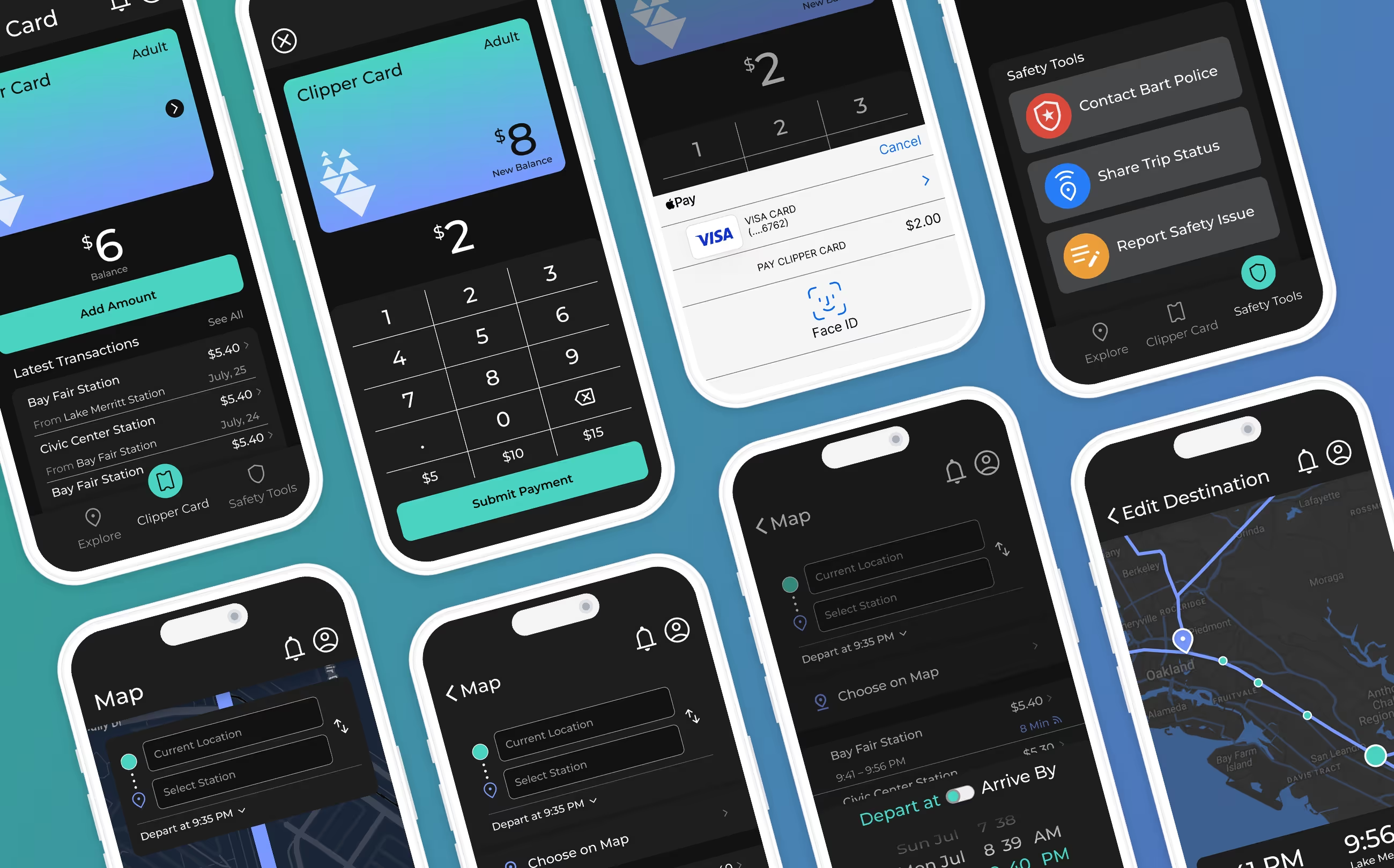
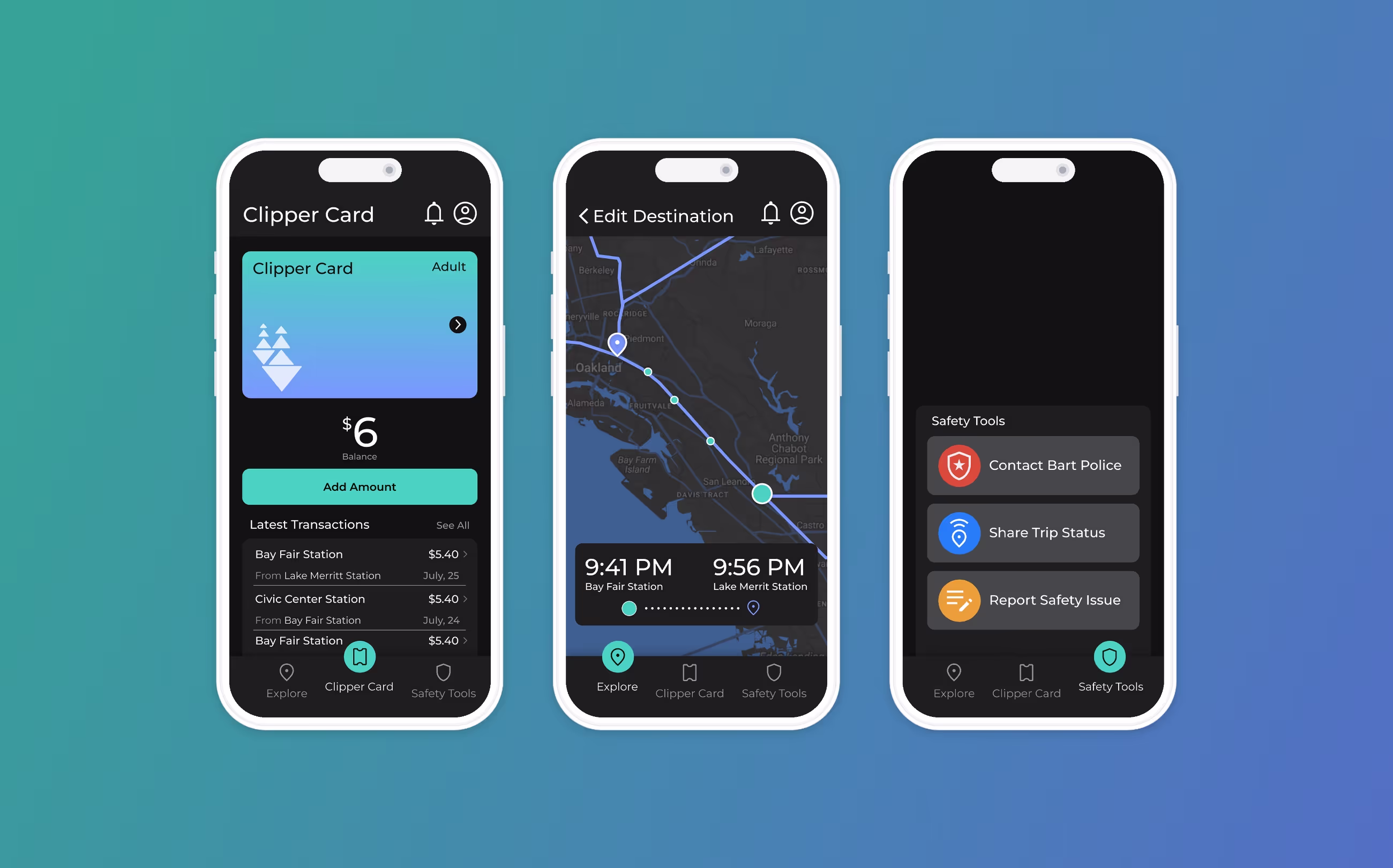
Final Redesign & New Screens
Drawing from my insights gathered during my research, I put everything together to create a consistent, modern, and high-contrast visual style for the new BART application.
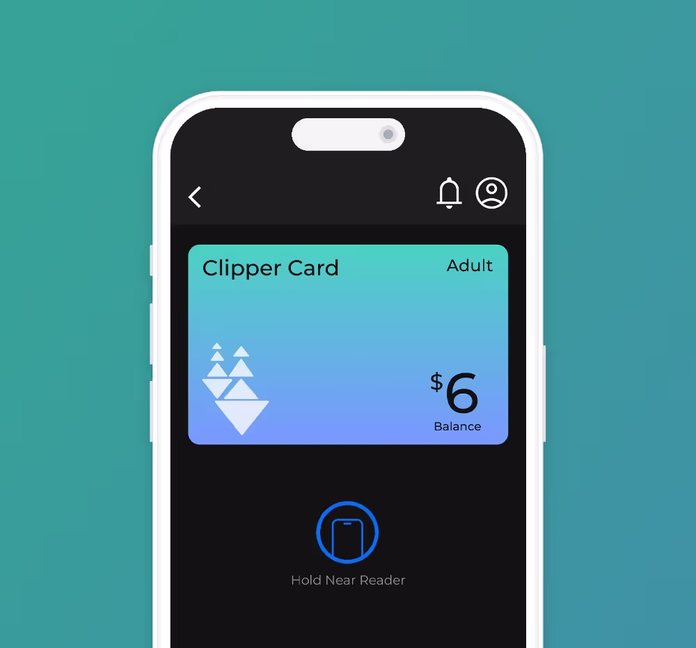
Contactless Fare Payments and Fund Management
Riders can now use their Clipper Card to board, add funds, and manage their balance conveniently.

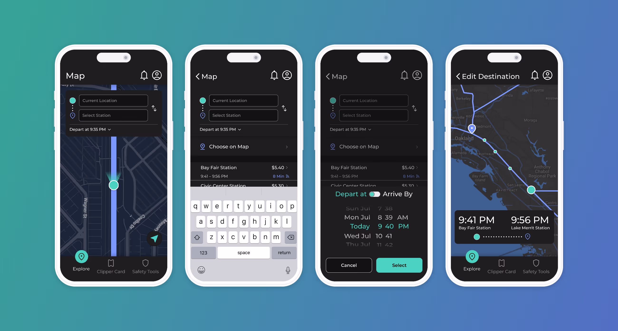
Choose Your Destination
Use GPS navigation to find the fastest routes to and from BART stations, and get real-time transit information by knowing the exact arrival and departure times of BART trains.
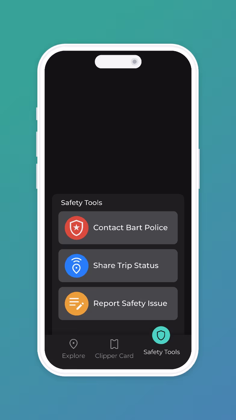
Feel at Ease: Safety Tools at Your Fingertips
BART cares about your safety, safety tools are at close reach and you can contact BART Police, share your trip status with a friend or report any safety issues you are noticing.
What I Learned
Reflecting on the Project Outcomes
This project was eye-opening in how, through research, I can strive to make more informed and objective decisions.
01
I have biases.
A designer's identification of pain points may be biased, whereas obtaining user feedback through application testing provides a more reliable approach for uncovering usability issues.
02
The lack of data.
Without data on user satisfaction, I, as the designer, cannot definitively say whether the pain points have had any real impact.